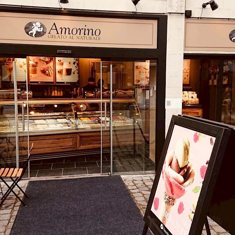
Amorino
A New Corporate Identity for the 20th Anniversary
Amorino is the leading artisanal ice cream franchise worldwide, with 200 locations across 17 countries: to celebrate its 20th anniversary, the brand entrusted us with a corporate identity redesign aimed at strengthening its Italian-rooted, internationally minded brand identity while also boosting customer engagement.


Where art meets taste: a refined and cohesive concept
With the aim of maintaining Amorino’s visual identity and reinforcing the brand’s positioning as a symbol of Italian craftsmanship, we developed a visual concept that highlights the qualities the company embodies. It draws inspiration from Italian art, a global hallmark of excellence, while translating it into the taste of the new millennium.
A distinctive element of the concept is the cherub (or amorino), which extends beyond the logo to become the central motif of the packaging. This approach makes the packaging more refined and authentic, reflecting the brand’s Italian soul and elevating it as an expression of the “art of living well.”